Python: Making predictions using machine learning on a dataset
AbdulSamad Olagunju / July 29, 2021
10 min read
Tutorials
How do you even start learning about machine learning?

We all hear about how machine learning is dominating the world, but nobody ever easily explains what is actually happens in a machine learning algorithm.
Let’s change that. In order to learn about this technology, we have to play around with this technology. I went to Kaggle and took a look at a dataset so that we can use some machine learning algorithms on it. Here is the dataset: URL
Before we can use those crazy machine learning algorithms, let me explain my limited understanding of machine learning.
Some Background
In this article, I will talk about supervised machine learning. In supervised machine learning, we provide data to our computer so that it can predict the value of some target variable, or classify some data as belonging to some class. This will make more sense as we implement a machine learning algorithm called KNN (K Nearest Neighbors) classification.
You need to understand some linear algebra to understand the algorithm used by the computer when it performs KNN, but that is out of our scope in this article. Instead, I will explain what the computer is trying to do in KNN classification.
The computer looks for which data points are close to the data we are trying to classify, and it classifies our data as belonging to the group of data it is the least distance away from. This image should clarify things.
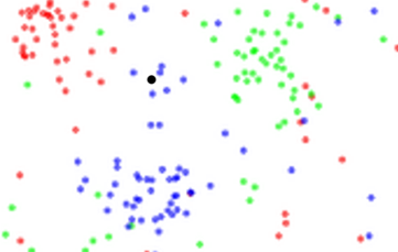
We have red, green, and blue dots. I am trying to classify what the black dot is. As it is close to the blue dots, I will probably classify it as a blue dot. This is the rationale behind K Nearest Neighbors classification.
Let’s actually start to look over the data. I will get my data from Kaggle.
This is the direct link: Kaggle Entrepreneur Data.
I will analyze the data using python. My work environment is Spyder.
We will begin with some exploratory data analysis. This is just figuring out what our variables are from the dataset, and the likely relationships between the variables in our data. I have an article about this that goes over it in more detail: Kaggle Data 1
The Code
First, I will import the necessary libraries.
#import libraries needed
import pandas as pd
import seaborn as sns
import matplotlib.pyplot as plt
import random
#don't want to see warnings on the console, usually about old functions like distplot
import warnings
warnings.filterwarnings('ignore')

from sklearn.neighbors import KNeighborsClassifier
from sklearn.model_selection import train_test_split
sklearn is great for machine learning. Here is a link to their website: sklearn. We will be using KNEigborsClassifier to compute our K Neighbors classification, and train_test_split to organize our data as training data or testing data.
df = pd.read_csv("https://raw.githubusercontent.com/abdulolagunju19/csv_files/main/entrepreneur.csv")

#first, let's do exploratory data analysis

#let's see total number of (rows,columns)
print ("Number of Rows     : " , df.shape[0])
print ("Number of Columns  : " , df.shape[1])
#take a look at column names
print ("\nColumn Labels : \n", df.columns.tolist())
print("\n")

#let's quickly look at a summary of the dataset
print(df.info())
#lets use .nunique to see categorical and numerical data
print ("\nUnique values :  \n", df.nunique())

#let's take a quick look at a total description of the dataset
print(df.describe(include="all"))

#take a look at first 5 rows of data
print(df.head())
In the code above, we take a look at the number of rows and columns in our dataset. There are 219 rows and 17 columns.
We then print the names of the columns. I can see that this is a dataset about whether or not an Indian college student is likely to be an entrepreneur. There are columns like 'EducationSector', 'IndividualProject', 'Age', 'Gender', 'City', 'Influenced', 'Perseverance', 'DesireToTakeInitiative', etc. These collect values about the personality of students, where they are from, whether they've completed a project, and more.
There is also a column called 'y'. This represents whether or not the student actually becomes an entrepreneur. We can use this column to see how accurate our machine learning model will be.
#check for missing data
print("\nMissing Values: " )
print(df.isnull().sum())

#column y is target variablewhether student is entrepreneur or not, I checked kaggle to figure that out
#the null values in ReasonsForLack are the entrepreneurs, they have no reason to lack as they are entrepreneurs

#lets deal with the missing values by Entrepreneur instead of NaN
df['ReasonsForLack'] = df['ReasonsForLack'].fillna('Entrepreneur.')

#lets check out the ReasonsForLack column now
print(df['ReasonsForLack'])

#let's see the number of missing values
print("\nMissing Values: " )
print(df.isnull().sum())

#lets check for duplicate rows
number_dup_rows = len(df) - len(df.drop_duplicates(keep="first"))
if (number_dup_rows != 0):
    print(f"\nNumber of duplicate rows found : {number_dup_rows}\nDuplicates removed!")
    df.drop_duplicates(keep="first",inplace=True)
else:
    print("No duplicate entries found!")
Over here, I'm doing some cleanup of my data. I'm looking at whether there are any missing values in my dataset. In the column 'ReasonsForLack', I see that there are several missing values. I check my df.info() and df.describe() information, and see that there are words in this data column. This column represents what students say is holding them back from being an entrepreneur.
The missing values in this column exist because there is no 'ReasonsForLack' for people who actually are entrepreneurs. I decide to fill in the null values with the word 'Entrepreneur'.
I check for duplicate columns and since there are none, I move on.
for variable in ['EducationSector', 'Gender']:
    #the random.randint is generating colours for our plots, use count plot
    sns.catplot(x=variable,data=df,kind="count",palette="Set"+
                      str(random.randint(1,3)),height=3.5,aspect=2, ci ="sd")
#most of the students are male
#most of the students are engineering students, this is India

plt.figure()
df["City"].value_counts().plot(kind="barh")

print(df.groupby("y").mean())

#let's take a look at ages
plt.figure()
sns.distplot(df["Age"]) #mostly 19 and 20 yr olds

#lets check out the number of people with "entreprenurial skills
df_skills=df[['Perseverance','DesireToTakeInitiative','Competitiveness','SelfReliance','StrongNeedToAchieve','SelfConfidence','GoodPhysicalHealth']]

#number of people predicted to be entrepreneurs, for each skill
for variable in df_skills:
    #the random.randint is generating colours for our plots, use count plot
    sns.catplot(x=variable,data=df,kind="count",palette="Set"+
                      str(random.randint(1,3)),height=3.5,aspect=2, ci ="sd", hue = "y")
plt.figure()
#y not really correlated with any factor
sns.heatmap(df.corr(), annot=True, linewidths=.5, fmt= '.2f')
plt.title('Correlation Heatmap')

#you can use this to see a histogram for each data category
plt.figure()
df.hist(figsize=(20,15))
In your exploratory data analysis, you have the freedom to choose how you want to analyze your data. I decided to make a correlation heatmap, some histograms, some count plots, and look at the differences between entrepreneurs and non-entrepreneurs using the groupby() function.
Feel free to make more plots, and play around with other functions in order to get a better understanding of what is going on in your data.
OK, our exploratory data analysis is complete. We will perform some machine learning now. I am going to use the KNN (K nearest neighbors) classification. We will test our data with our machine learning algorithm and see how accurate it is.
#we need to classify some of our data as testing and training data
#we are trying to predict y, we are using other columns to predict y
#I didnt choose city, gender, I want to predict entrepreneurship based on skill of person
#test_size means 30% of data in testing set, 70% in training set
#overfitting is when it works well for data you build model with but terrible with real world data
X_train, X_test, y_train, y_test = train_test_split(df_skills, df['y'], test_size=0.3, shuffle=True)

#lets see how our training dataset looks like
print(X_train)
plt.figure()
sns.distplot(X_train["SelfConfidence"])
plt.title("Self-Confidence Training Set")

plt.figure()
sns.distplot(X_test["SelfConfidence"])
plt.title("Self Confidence Testing Set")
#now, let's build KNN

knn = KNeighborsClassifier(n_neighbors=14)
knn.fit(X_train,y_train)
predictions_knn = knn.predict(X_test)

#so we can get the accuracy of our KNN
from sklearn.metrics import accuracy_score

print(f"Predictions: {predictions_knn}")
print(f"Accuracy: {accuracy_score(y_test, predictions_knn)}")
Now, after splitting your data into training and testing sets, you can easily put your data into the KNeighborsClassifier function. Print your results, and Boom! You have your own machine learning program!
I learned how to do these analyses from these links pages:
- Machine Learning Mastery
- Kaggle- Entrepreneurial Data Analysis
- Visualization-EDA-NLP
- Machine Learning Predictions
- Machine Learning Tutorial
Enjoy!

Here is all of the code:
#import libraries needed
import pandas as pd
import seaborn as sns
import matplotlib.pyplot as plt
import random
#don't want to see warnings on the console, usually about old functions like distplot
import warnings
warnings.filterwarnings('ignore')
from sklearn.neighbors import KNeighborsClassifier
from sklearn.model_selection import train_test_split

df = pd.read_csv("https://raw.githubusercontent.com/abdulolagunju19/csv_files/main/entrepreneur.csv")

#first, let's do exploratory data analysis

#let's see total number of (rows,columns)
print ("Number of Rows     : " , df.shape[0])
print ("Number of Columns  : " , df.shape[1])
#take a look at column names
print ("\nColumn Labels : \n", df.columns.tolist())
print("\n")

#let's quickly look at a summary of the dataset
print(df.info())
#lets use .nunique to see categorical and numerical data
print ("\nUnique values :  \n", df.nunique())

#let's take a quick look at a total description of the dataset
print(df.describe(include="all"))

#take a look at first 5 rows of data
print(df.head())

#check for missing data
print("\nMissing Values: " )
print(df.isnull().sum())

#column y is target variablewhether student is entrepreneur or not, I checked kaggle to figure that out
#the null values in ReasonsForLack are the entrepreneurs, they have no reason to lack as they are entrepreneurs

#lets deal with the missing values by Entrepreneur instead of NaN
df['ReasonsForLack'] = df['ReasonsForLack'].fillna('Entrepreneur.')

#lets check out the ReasonsForLack column now
print(df['ReasonsForLack'])

#let's see the number of missing values
print("\nMissing Values: " )
print(df.isnull().sum())

#lets check for duplicate rows
number_dup_rows = len(df) - len(df.drop_duplicates(keep="first"))
if (number_dup_rows != 0):
    print(f"\nNumber of duplicate rows found : {number_dup_rows}\nDuplicates removed!")
    df.drop_duplicates(keep="first",inplace=True)
else:
    print("No duplicate entries found!")

for variable in ['EducationSector', 'Gender']:
    #the random.randint is generating colours for our plots, use count plot
    sns.catplot(x=variable,data=df,kind="count",palette="Set"+
                      str(random.randint(1,3)),height=3.5,aspect=2, ci ="sd")
#most of the students are male
#most of the students are engineering students, this is India

plt.figure()
df["City"].value_counts().plot(kind="barh")

print(df.groupby("y").mean())

#let's take a look at ages
plt.figure()
sns.distplot(df["Age"]) #mostly 19 and 20 yr olds

#lets check out the number of people with "entreprenurial skills
df_skills=df[['Perseverance','DesireToTakeInitiative','Competitiveness','SelfReliance','StrongNeedToAchieve','SelfConfidence','GoodPhysicalHealth']]

#number of people predicted to be entrepreneurs, for each skill
for variable in df_skills:
    #the random.randint is generating colours for our plots, use count plot
    sns.catplot(x=variable,data=df,kind="count",palette="Set"+
                      str(random.randint(1,3)),height=3.5,aspect=2, ci ="sd", hue = "y")
plt.figure()
#y not really correlated with any factor
sns.heatmap(df.corr(), annot=True, linewidths=.5, fmt= '.2f')
plt.title('Correlation Heatmap')

#you can use this to see a histogram for each data category
plt.figure()
df.hist(figsize=(20,15))

#we need to classify some of our data as testing and training data
#we are trying to predict y, we are using other columns to predict y
#I didnt choose city, gender, I want to predict entrepreneurship based on skill of person
#test_size means 30% of data in testing set, 70% in training set
#overfitting is when it works well for data you build model with but terrible with real world data
X_train, X_test, y_train, y_test = train_test_split(df_skills, df['y'], test_size=0.3, shuffle=True)

#lets see how our training dataset looks like
print(X_train)
plt.figure()
sns.distplot(X_train["SelfConfidence"])
plt.title("Self-Confidence Training Set")

plt.figure()
sns.distplot(X_test["SelfConfidence"])
plt.title("Self Confidence Testing Set")
#now, let's build KNN

knn = KNeighborsClassifier(n_neighbors=14)
knn.fit(X_train,y_train)
predictions_knn = knn.predict(X_test)

#so we can get the accuracy of our KNN
from sklearn.metrics import accuracy_score

print(f"Predictions: {predictions_knn}")
print(f"Accuracy: {accuracy_score(y_test, predictions_knn)}")